

Concise Game menus and Quicker Game launches [1/4]
Designed a four step multiplayer party creation process which resulted in longer session durations since users could spend more time on gameplay. The user flow incorporates a thoughtfully designed informational hierarchy for navigation where primary and secondary CTA were assigned different UI components. As a result the home screen has only four main options which allows for quicker decision making. This design was implemented across 20+ live titles at Groop Games.
Feedback loops and Reward Mechanics [2/4]
While playtesting the analog version of At Once and a couple of other desktop games from Groop Games, it was found that user feedback an important heuristic principle was amiss. Users had a difficult time finding required action buttons, identify and locate their relative position in the user flow, and emote reactions throughout the gaming experience. Designed a complex color scheme incorporating tertiary colors for larger GUIs, neutrals for CTA and conventional colors for respective component states. Scoring being the paramount of this game was emphasized through a live scoring feature with bouncy score counter animations.
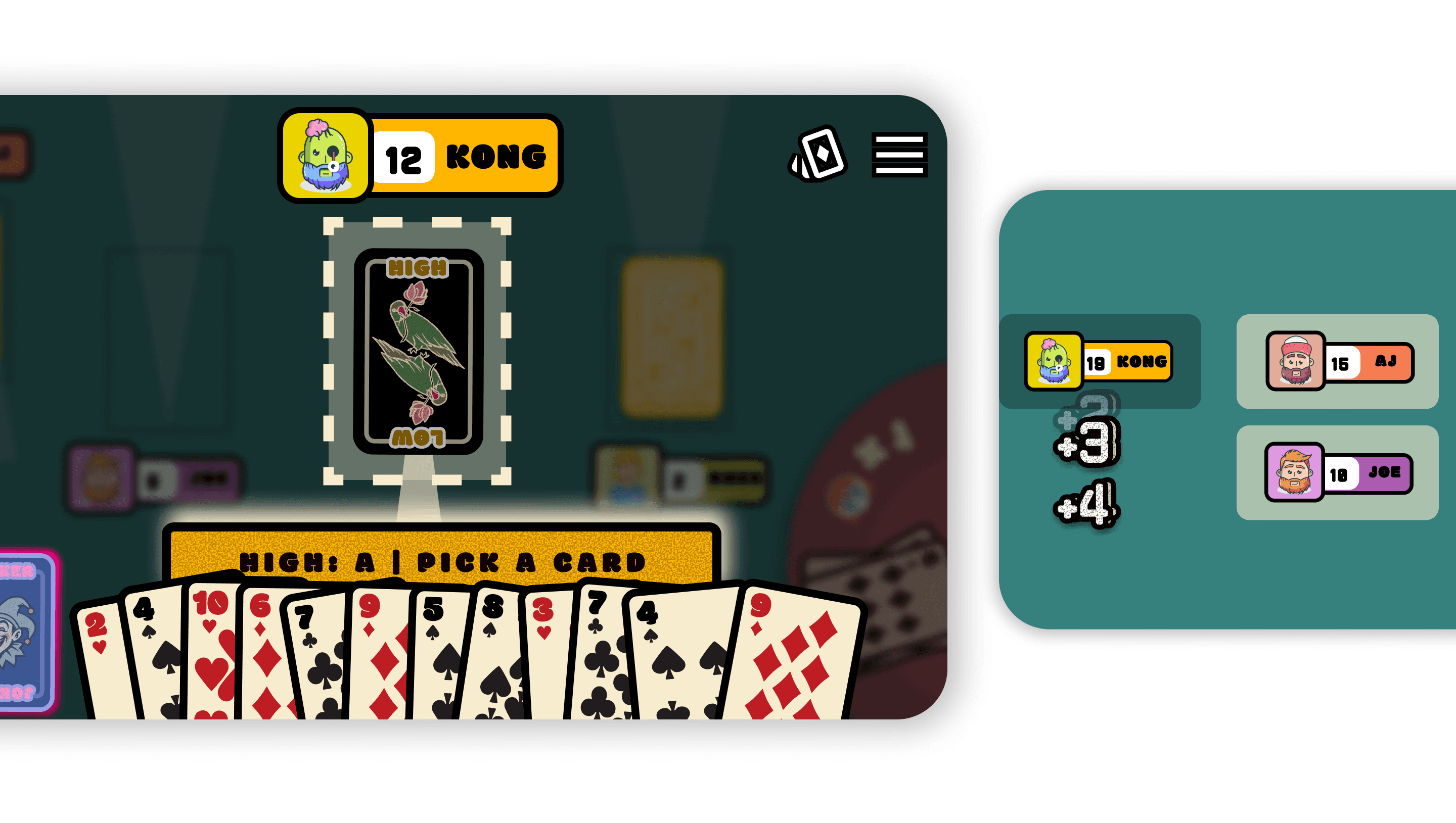
Focused based game environment [3/4]
Heralded a one of its kind focus based multiplayer card game experience that allows players to navigate gameplay in a more streamlined manner as opposed to showing all player decks and UI. The usage of focus overlays along with highlight cues to initiate intuitive action and decision making, creates a seamless interface.
An enviable file convention [4/4]
From naming conventions, component libraries, style guides to prototype handovers - best practices for figma have been the pinnacle of this project to ensure faster development and shipping times. This file convention was used as a guide by 10+ junior designers onboard.
Looking for more?

