8 mins
Having spent a childhood under the influence of a (somewhat) cool older brother, video games were a staple in our house. More than often against the wish of our Indian parents. I grew up playing games like Crash Nitro Kart, Spyro, DarkSiders 2, MarioKart, Need For Speed, Sleeping Dogs, Assassins Creed - to name a few. (More recently I finished Final Fantasy XVI.) Despite my brother always asking me, "Stuti, are you just smashing random buttons?" during intense boss fights - I played my heart out. I learnt to appreciate a game not just for its combat friendliness or strategy, rather it was the story, nuanced character development, and the mind-blowing artwork paired with painstaking details to render every tiny component or super liminal backdrop for game environments that glued me to the controller. My recent project for Groop Games, an independent Game development studio based out of Kodai in India, was my first and favorite Game UX stint where I brought an original card game to life on screen alongside a team of illustrators and developers.
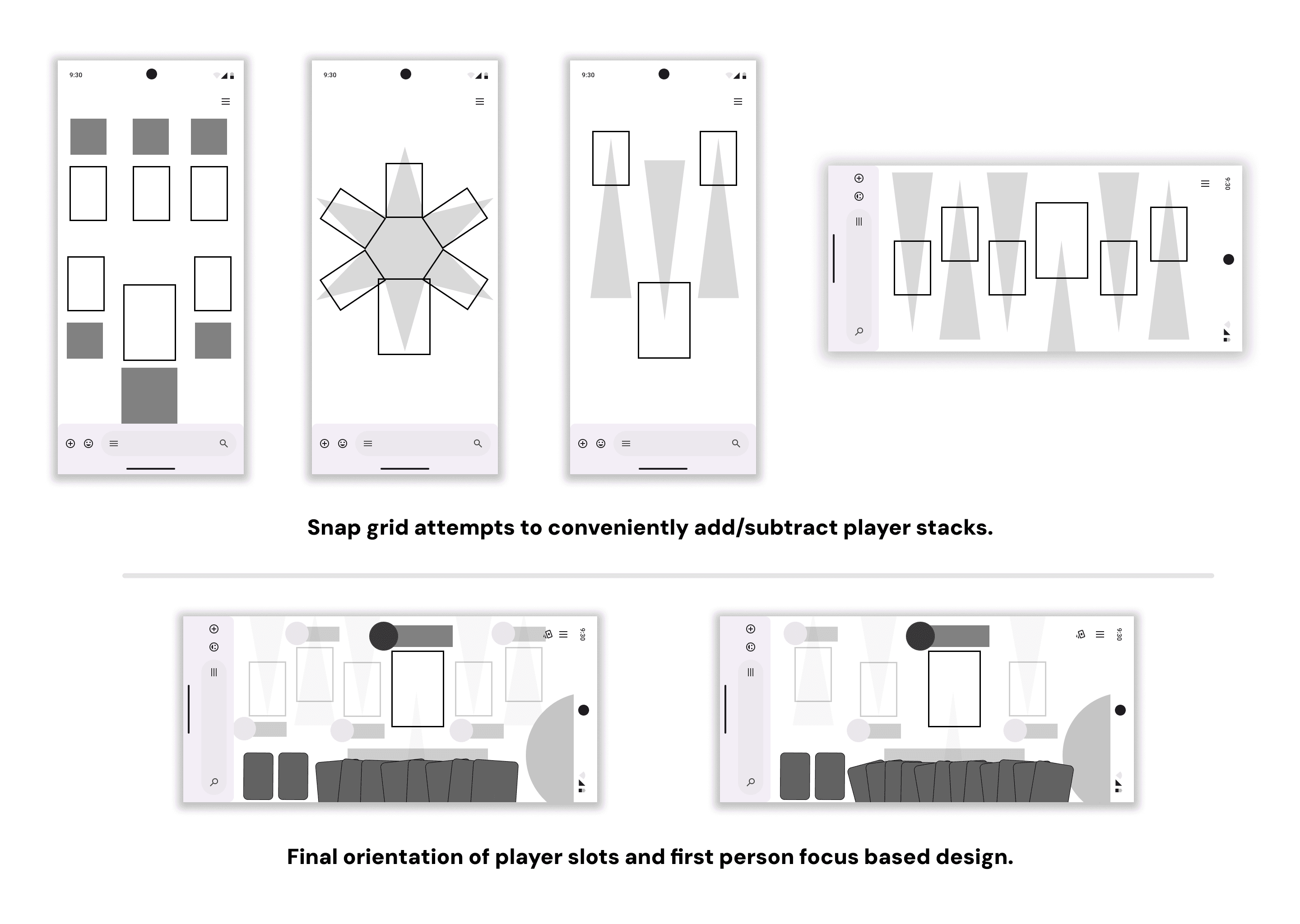
This was one project where I felt safe enough to explore beyond the standard agile UX process followed in tech, and finally also share with everyone why I am not a huge fan of the (in)famous user persona template. Scroll and maybe read on for a bit, if you want to see how I pivot from or rather allow unique data points to emerge during observational studies.
For understanding At Once and other games from Groop games - about three games (including At once) were played over a span of two weeks with 3-4 players to understand their reactions and motivation towards analog and digital card playing experiences.
Quick Heuristic Evaluation
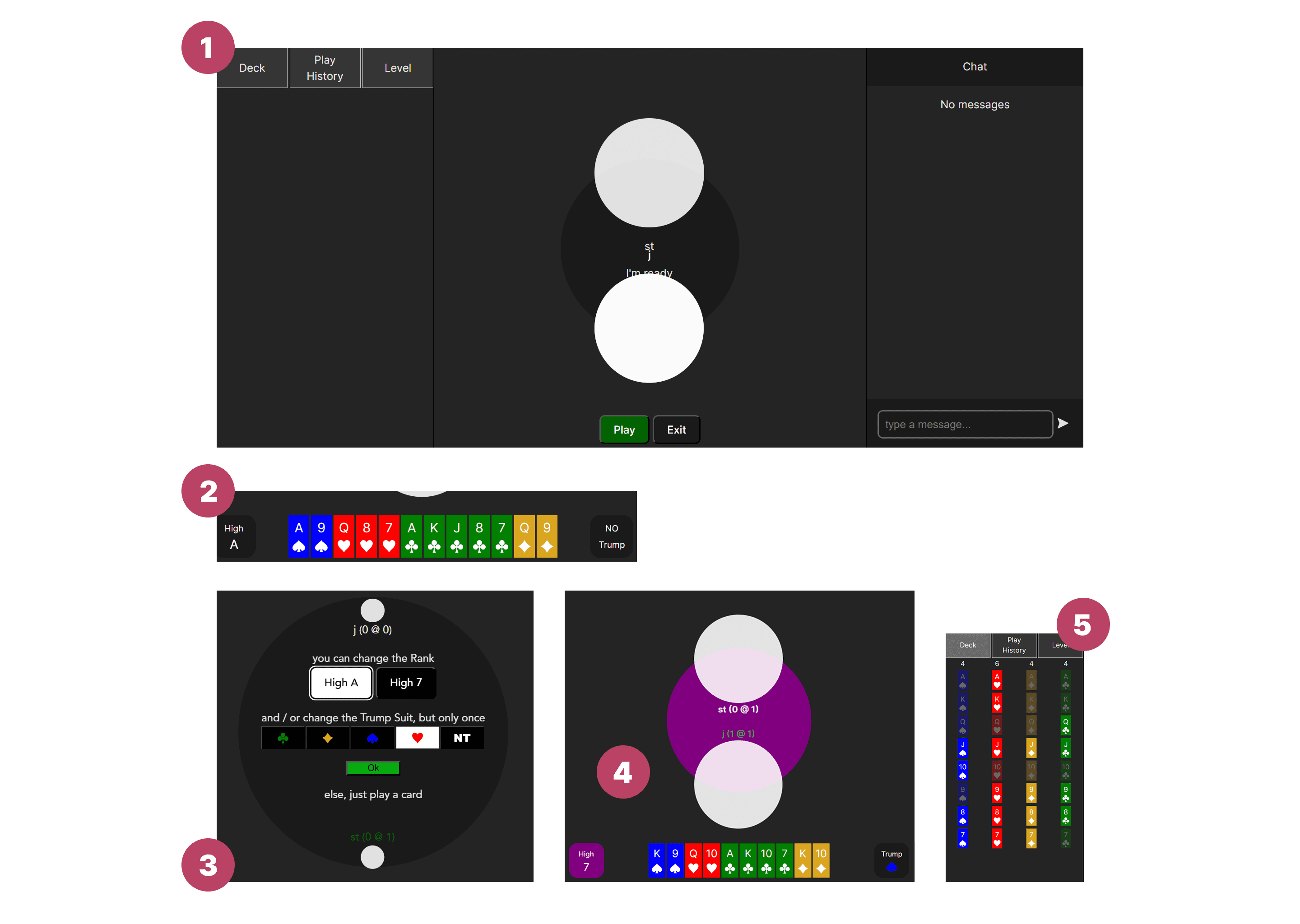
UI misinterpretation due to unmarked elements and variable select states of cards
Often users were found to miss the select button for H/L card and change trump option as a result intended action was not implemented.
Users could not figure which card had been chosen or whose turn it was due to the highlight color of active player not being prominent.
Deck viewing feature was not utilized as much for strategizing even winning moves.
Card sizes ratio made it hard to read player deck.
The circular “table” at the center was also confusing.
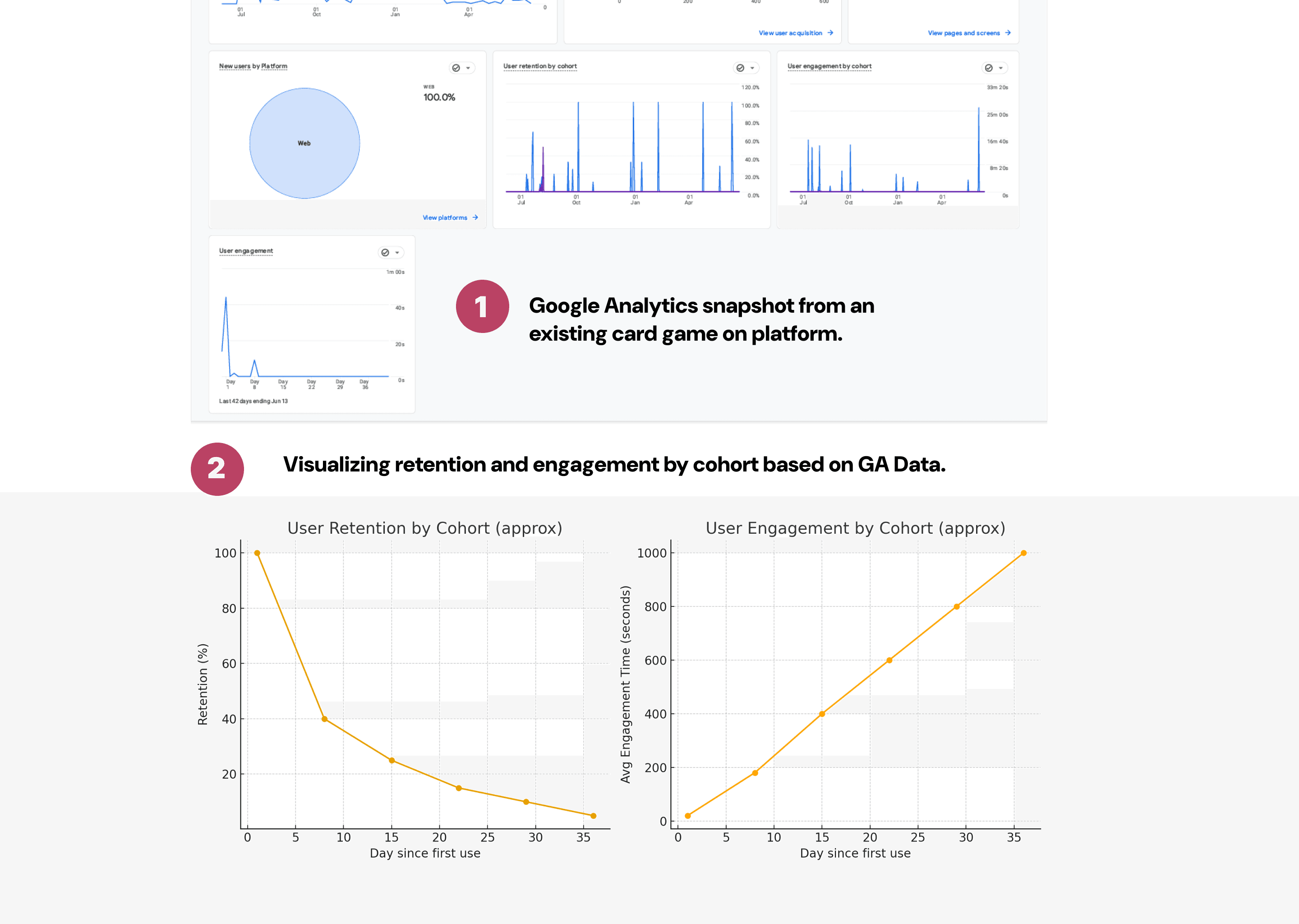
Google Analytics Audit from existing card game
Retention drops sharply after the first week, with only a small percentage of users remaining active by Day 30+.
Engagement time shows that while most users churn quickly, those who stay become more deeply engaged (spending up to ~30 minutes per session).
This pattern suggests a two-tier user base: many casual drop-ins, and a smaller group of highly committed users

Playtesting (UX Research) Design
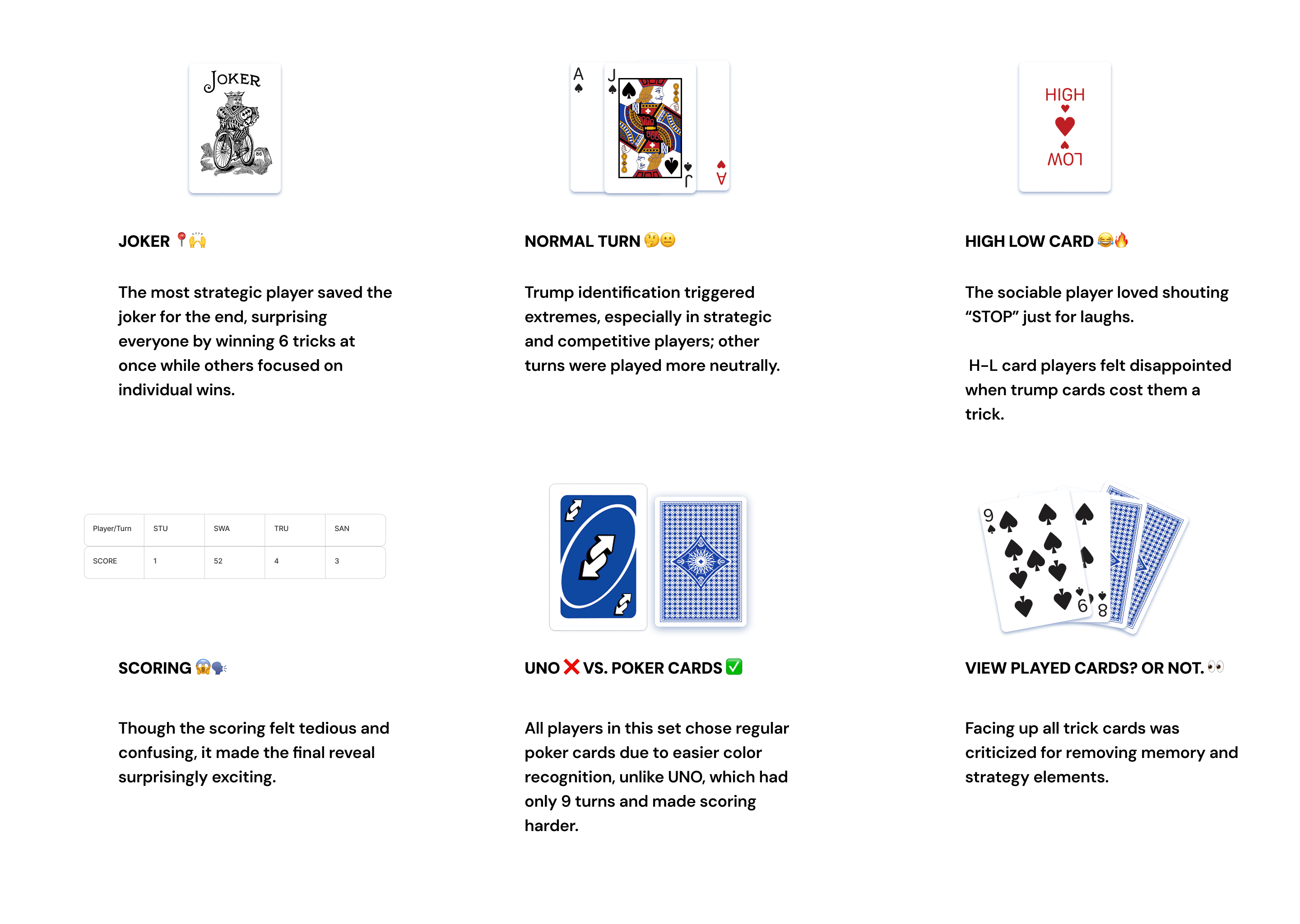
5/10/25 | Today we will be playing At Once for the second time after a two week hiatus from playing any game. We have two decks of cards with the same back. After a few rounds we may opt for UNO cards.
Objectives
To understand what is causing errors or confusion in the game mechanic, if any. Conversely, any points of increased engagement will also be studied.
To compare the enthusiasm levels and adaptability with UNO cards.
Methodology
Any error made will be counted - and players will be asked a non disruptive follow up question in-game to understand what happened.
A record sheet will be made to mark such errors.
A follow up interview with players will be carried out to understand their inclination towards a specific card type.
Observation Notes
→ Since the game was being played with people who were familiar with the rules, the error rate was very low : 3/44 turns.
→ As a result, the metric in consideration changed from error count to reaction count. i.e. to my best capacity I tried to note what move elicits a reaction and why.
→ Instead of describing each reaction - the 3 fixed moves of (normal turn, joker, H-L card) were mapped to these reactions.
Card move - 2 - Emotion Map | Qual UX Analysis
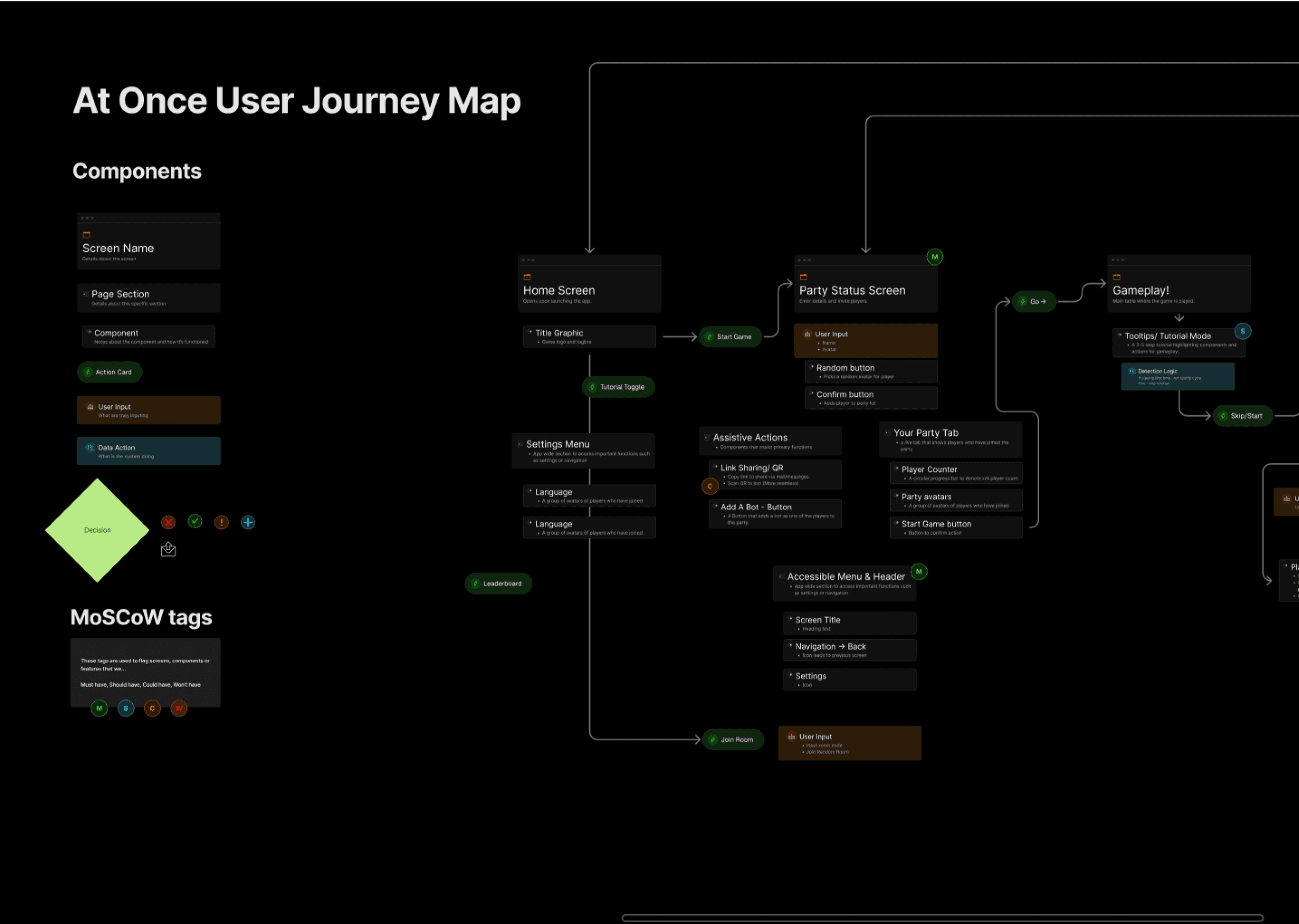
Design Decisions based on analysis and findings.

Looking for more?

